We have seen so many richly decorated buildings on this trip, now it is time for some bare bones minimalist architecture.
| Come late September, Dora is up for sale.
If you or anyone you know is looking for a reasonably priced motorhome then please check out the following link; https://www.2wanderers.com/dora-for-sale/ or if you have any questions email us at; Thanks |
Warning, geek architectural rant about to start.
For some reason, back in the 1920’s Brno became one of the centres of a new architectural style, modernism. It wasn’t really on our route, but a little bit of a detour to see some stripped down, purist architecture. Now that really shouldn’t be missed, should it?
Now I have to come clean, as clean as a modernists pencil, I like this stuff, it resonates with me. I don’t like all that applied decoration, I don’t get it, it is way to fussy for me.
So what was modernism all about, well simplicity and light and as one of the key exponents of the style, Ludwig Mies van der Rohe, would say ‘Less is more’, but more from him a little later.
After a relatively tranquil night in the suburbs we followed the trolleybus line into the centre, found a place to park Dora and walked into town.
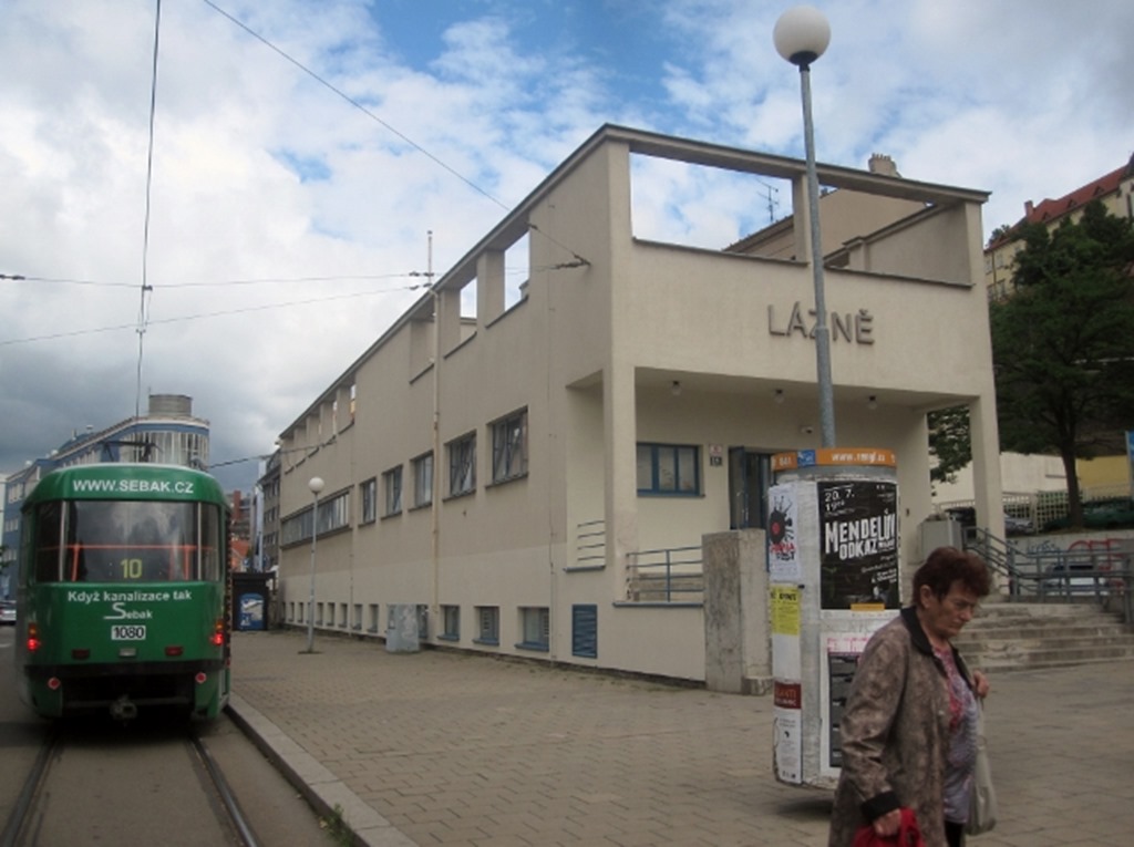
Immediately we were struck by a series of cuboid, buildings, this one I think was some sort of medical centre.
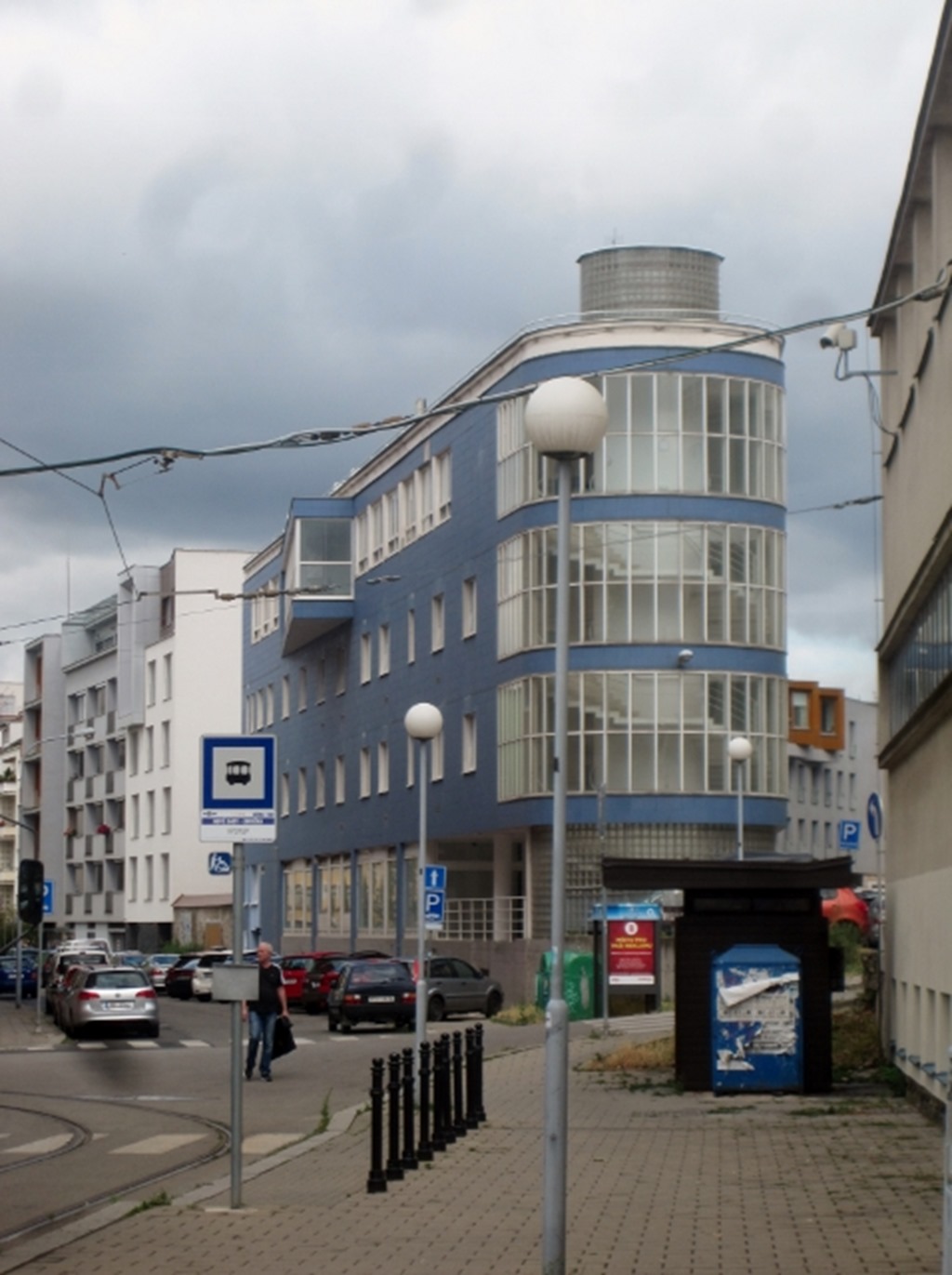
Lovely stair and amazing windows and what a way to turn the corner.
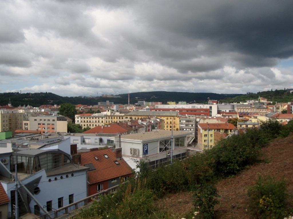
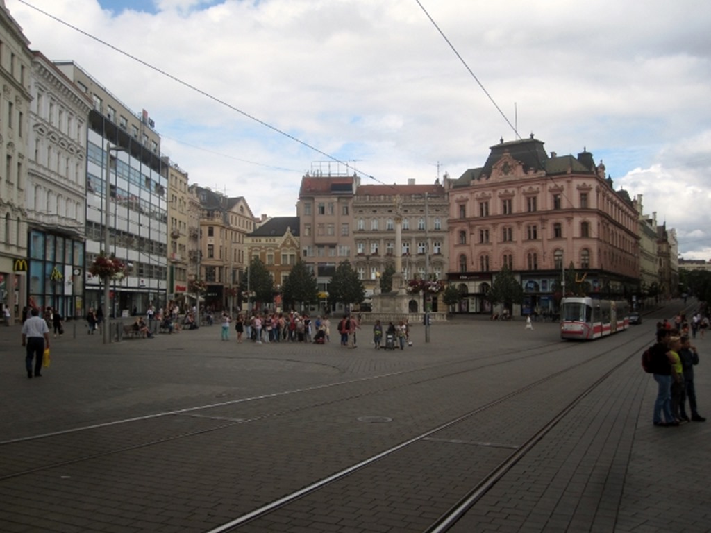
It was a moody day, as we climbed up to the old town and the central square.
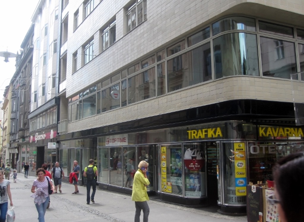
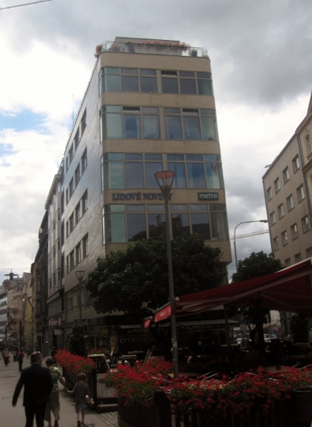
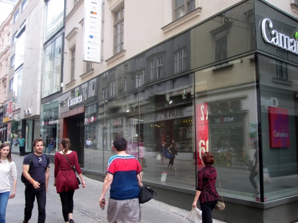
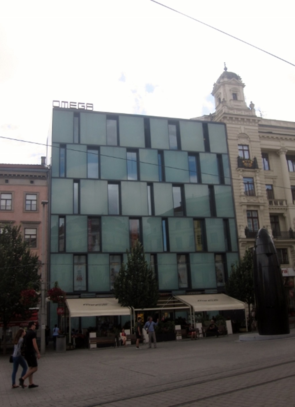
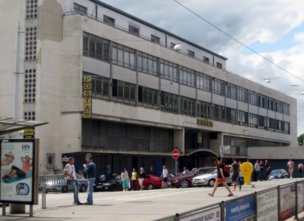
And once in the square, everywhere you looked, building after of building of beautiful simplicity. Sometimes it is quite difficult to tell whether this is an original from the 20’s of 30’s, a refurb, or a new build in the same style. Some might say they do not like modernism, but it is a style which has lasted, and continues to surround us, and influences many aspects of design.
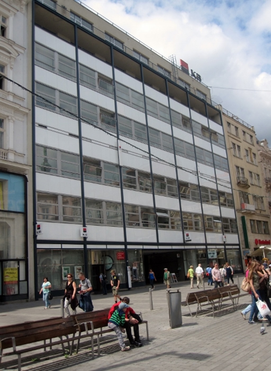
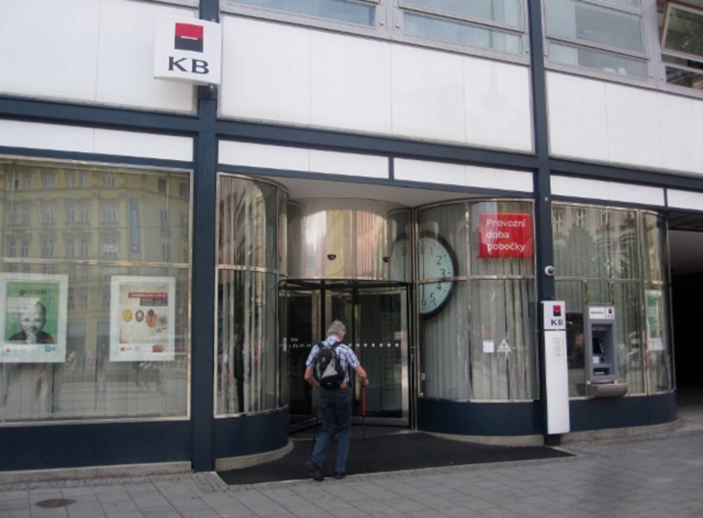
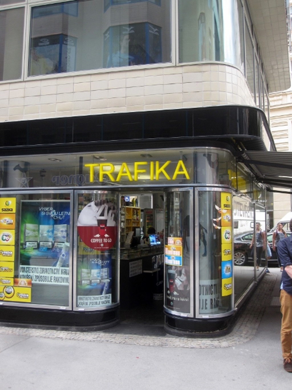
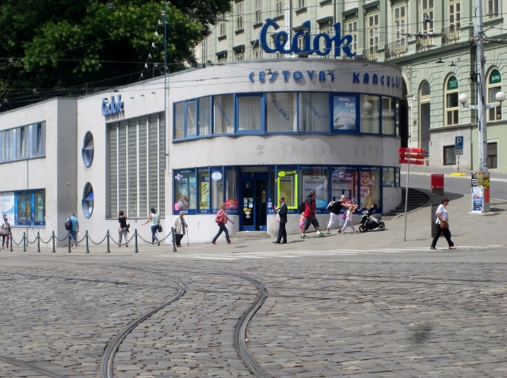
Clean, elegant, monochrome and chrome! Who could ask for more? That curved glass sucking you into the building.
Not sure about that thin strip of white though below the grey grid, should have pushed the window up a little more, or pushed the grid down, no one would have noticed the slightly larger bottom panel!
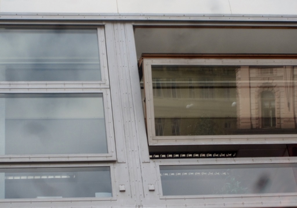
And I really love that folding window, which is actually in timber, which makes me think this may be modern. Every screw head here is expressed. The rigour of the engineering creates the aesthetic, there is no need of an applied decoration. How superfluous it would be to now plaster over the top some ornamentation, some extra pattern.
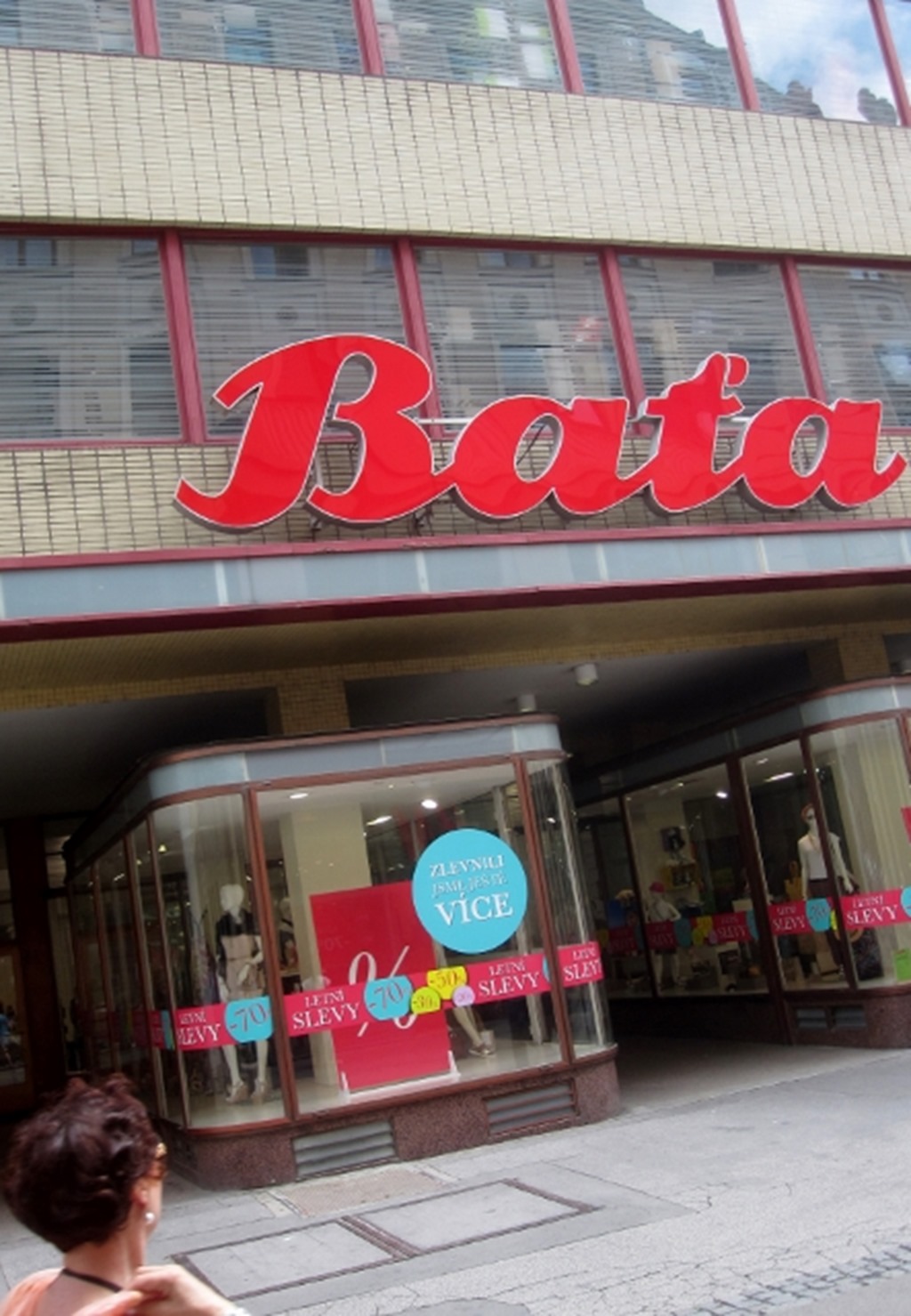
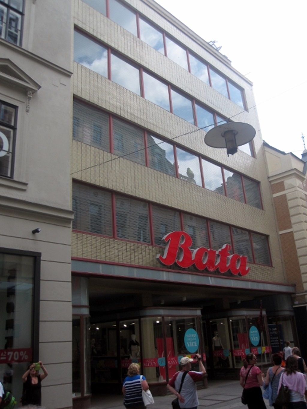
The Bata shoe company has always been at the forefront of modernism. Head out east from London, past Dagenham and they built not just a factory, but a small town for the employees, all modernist. The factory is now just a derelict shell, but the housing survives.
Check out a bit of Jonathan Meades if you want to know more.
There is something so classy and cool about shiny black, shiny white, curves and chrome.
The Americans adopted this for the diner and car look of the 50’s. They knew cool.
And all that glass, linear, cutting the building into horizontal layers. Looks great on the outside, but try and imagine the quality of light on the inside, brilliant.
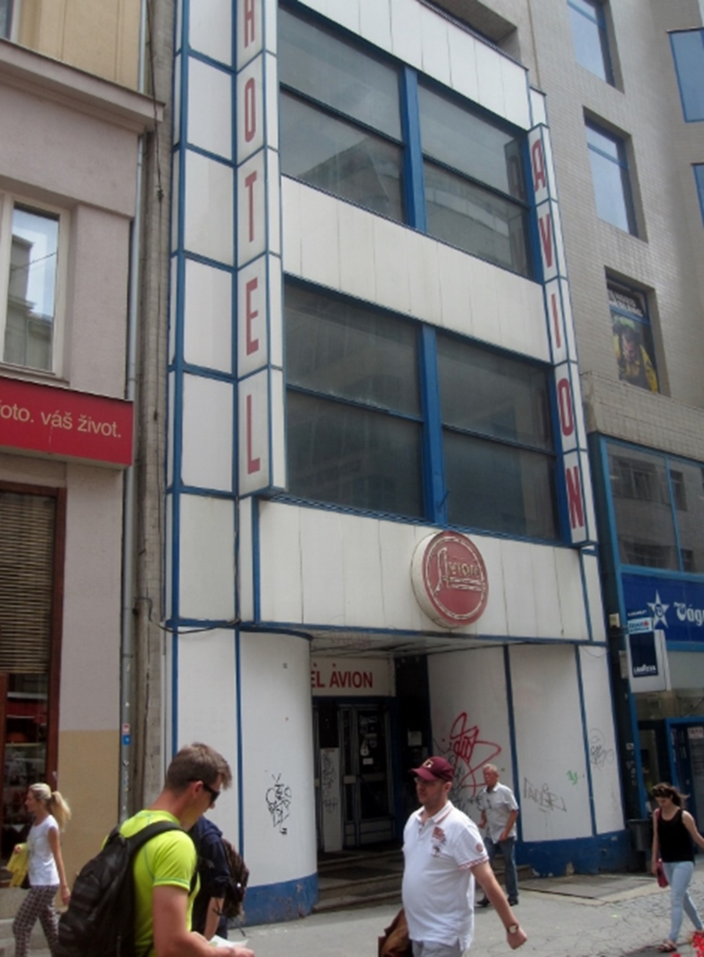
This one hasn’t been refurbished yet, but still looks fabulous, look at those amazing graphics, so simple, so clear.
And her I think is the slight problem, especially in the UK. This style has permeated every part of our culture.
That bank shop front, invariably modernist; simple clean lines, lots of glass, sound familiar.
iPhone or Samsung; simple clean lines, lots of glass…modernist.
Ikea furniture invariably modernist.
And what do we want to live in? Some mock, faux, throwback to Georgian, Victorian or some fake timber framed nonsense.
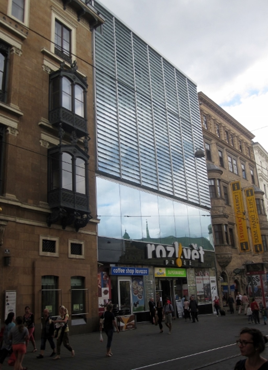
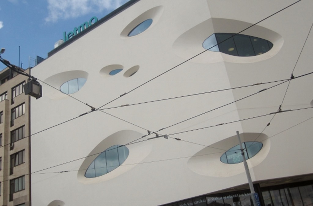
Ok, some of the more recent interpretations are frivolous and irrelevant, or maybe there is some mathematical and environmental reasoning behind the patterning of this facade, but it is still fundamentally modernist.
There are some, the ill educated future monarch of the commonwealth, who would banish modernism to the bin. Now I would not knock down all that old stuff just because it was dripping with ornament, it is somewhat functional as a building still, and it also fits in quite nicely with the newer stuff around it, no, let the best examples survive to live cheek by jowl.
See, modern, new, looking forwards, not backwards.
But we have another type of superfluous style that has emerged over the last decade or two.
Just because you can do it, doesn’t mean you should do it!
Just because it looks good as a drawing, doesn’t mean it will be a good building. This type of facadalism, this wallpaper, is the worse. Nothing underpinning it at all, just fashion.
We have managed to pop into the tourist information office, so we now know what buildings to visit in the suburbs. Time to head back to Dora…
Linear windows, glass bricks, could do with a bit of TLC though.
And today are we obsessed with scale. Small, elegantly forms, can be beautiful.
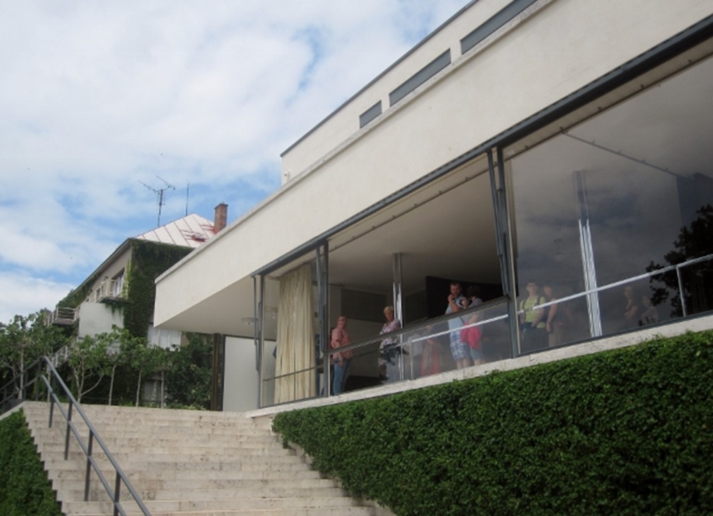
We head to a Mies masterpiece. We don’t get the full on tour, these are booked out for three months, but all that glass, I bet we get to see plenty of what is going on.
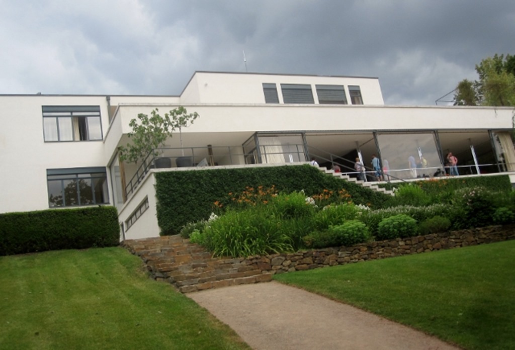
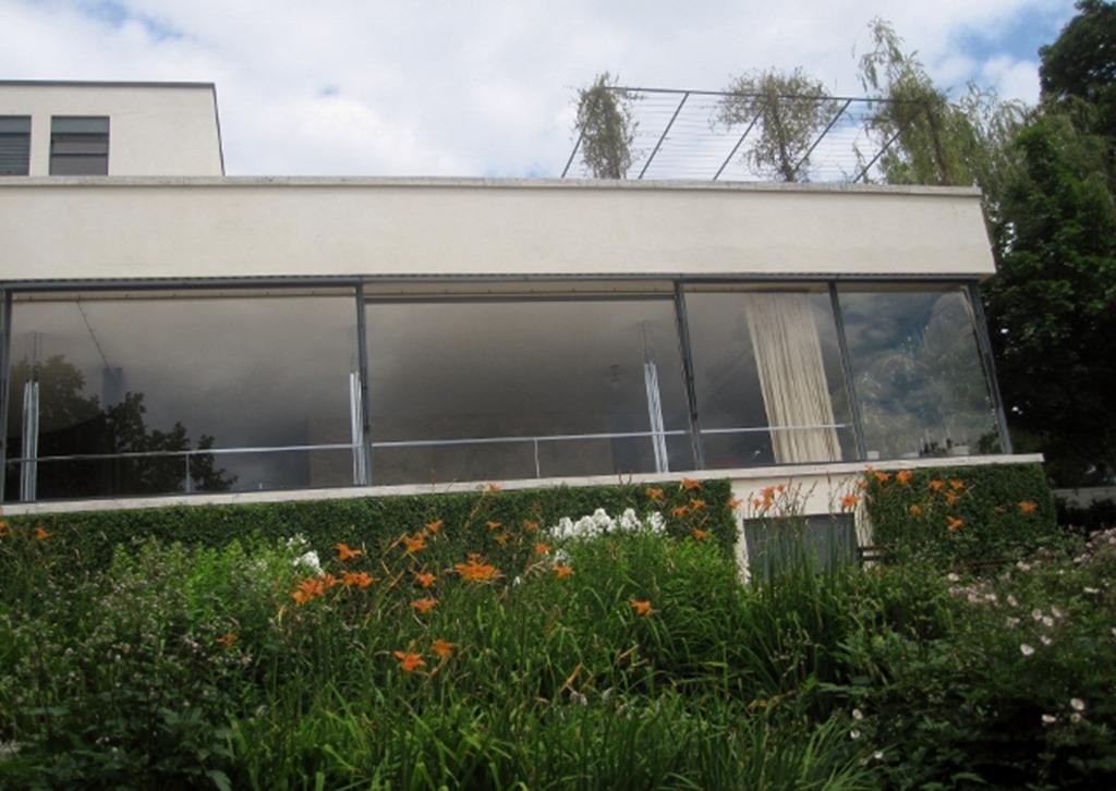
This villa was built for the Tugendhat’s and I think it would be fair to say, they had plenty of money.
This is one indulgent villa.
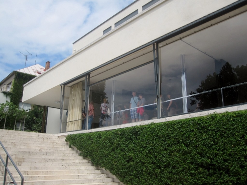
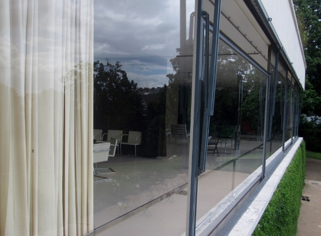
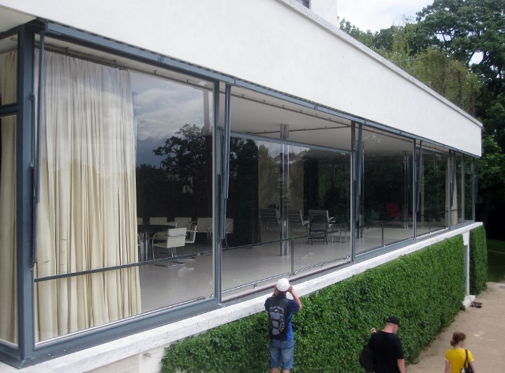
See that window, its a bit higher than the last image. It slides down into the ground. Outrageous…
There are many things about this building that would just not be acceptable today. This is pretty much the rape of worldwide resources; timber from every primary rainforest on earth, well they could afford it!
Those enormous panes of glass are still considered big today.
You get the feeling money was no problem.
And in many ways, money is still considered no problem. The last refurbishment cost 180m Czech crowns (about €6.5m).
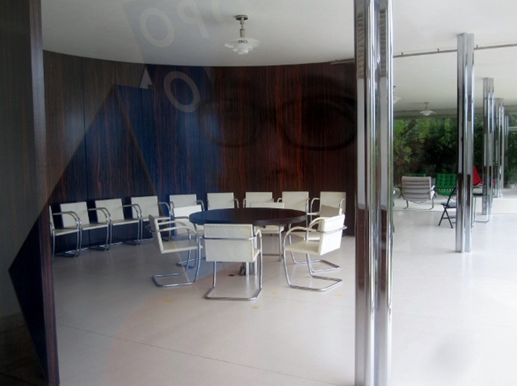
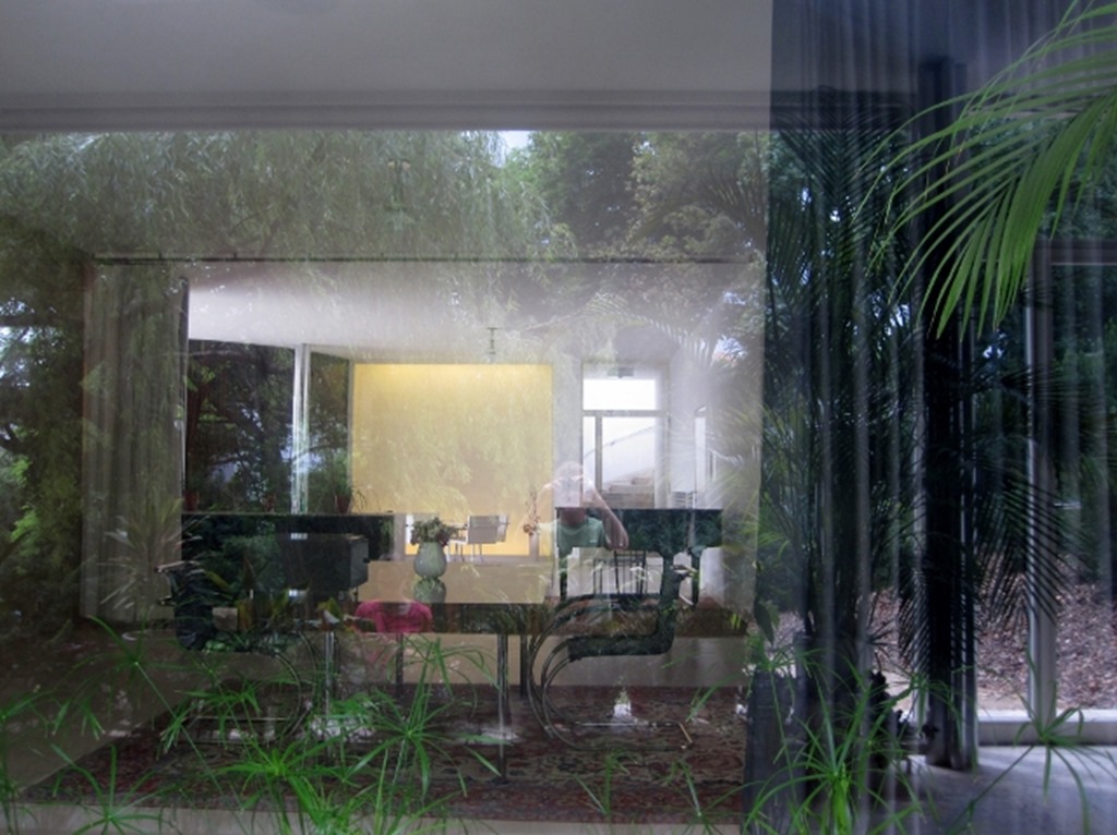
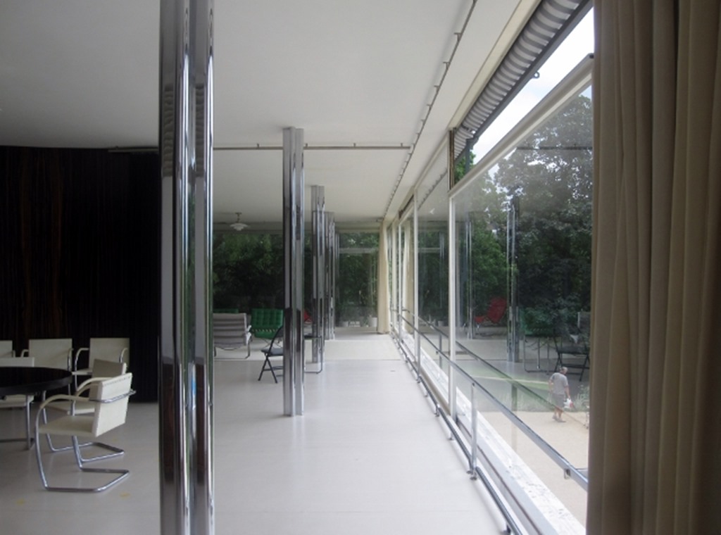
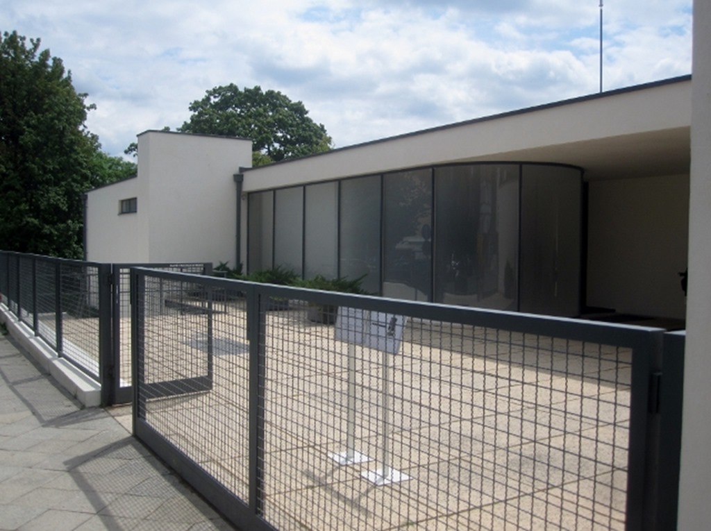
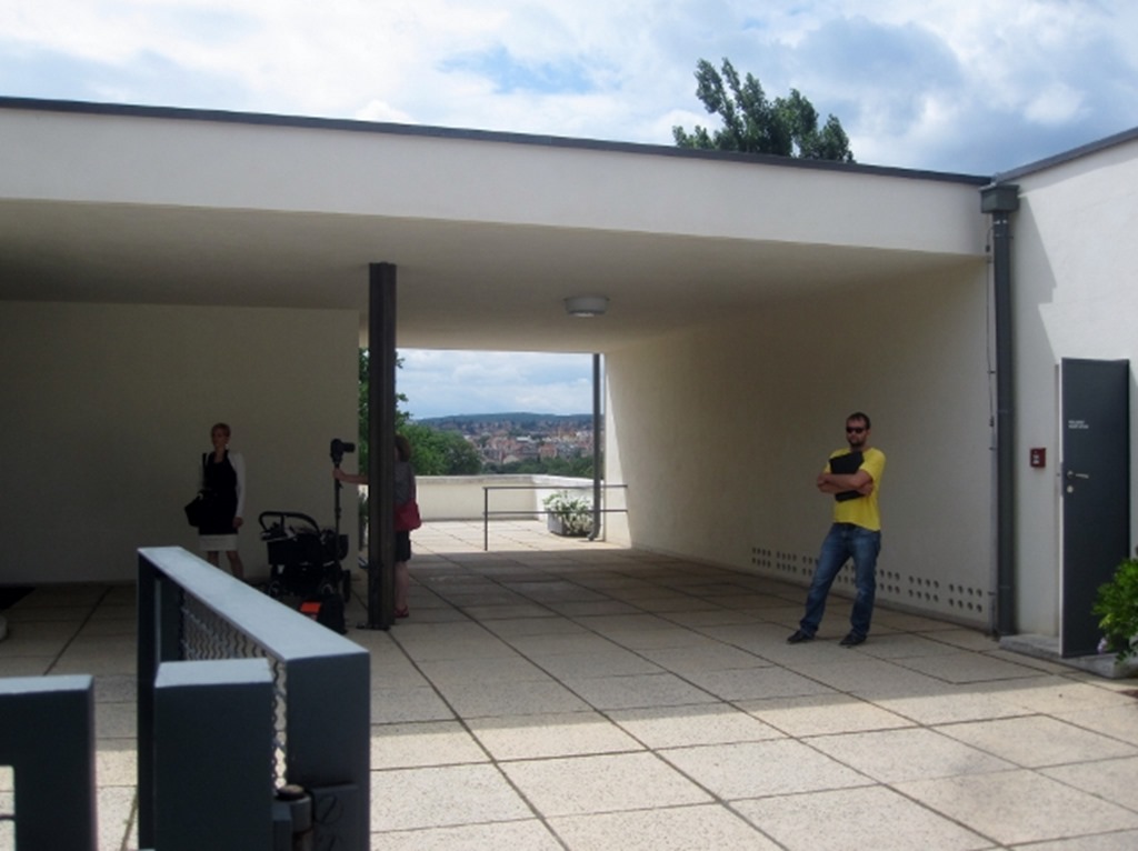
There are many things to like in this building; the open space that flows from one part to another, the expanses of glass which light every corner, the connection with nature, sky and air, the lack of ornament, the simple clean lines.
He also designed all the furniture.
There were many innovations in this building; the steel structure, here covered by chrome and the ventilation system, usually used in offices.
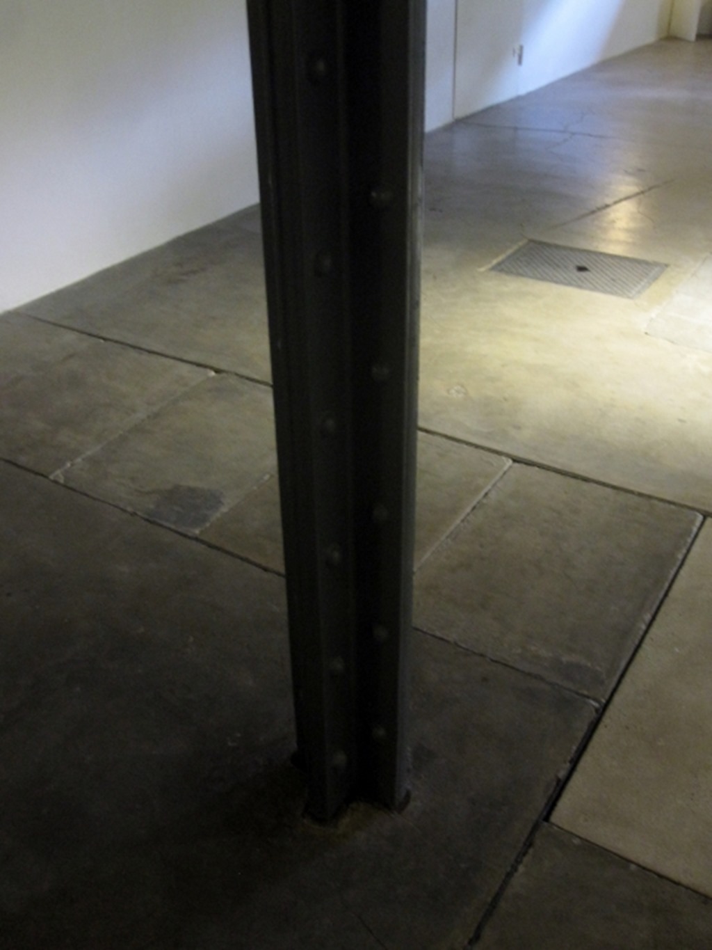
It is actually amazing to see that steel structure bare, as it is in the basement, I think it is better and purer that way.
There are many features that impresses me about this house; the scale of it; the light; the being one single open space with the ability to keep the singularity of the rooms. However, would it work for me as living house? Not sure. It is too big. Inevitably, I wouldn’t use the house fully on a daily basis, just what the space I need. There would be so much that would be wasted. Also, would it be warm? A biggy for me. No, says Gary. Therefore, no, it wouldn’t work for me. SM.
No extruded cruciform shape, it was all made with angles and flat plate, bolted together
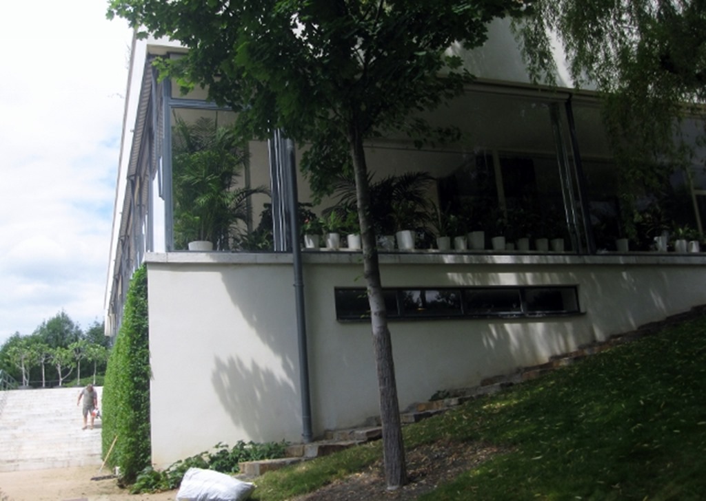
But it is those amazing windows that you keep returning to.
It is this that makes the whole building float.
There was some question about how easy this building was to live in, but the client always defended her building, although she did say the white linoleum flooring was very difficult to keep clean!
It was built between 1928 and 1930 but they only got to live in it for eight years, fleeing to Switzerland and then Venezuela in 1938 to escape the Nazis.
They never got to return, so as a house, the building has a short life.
And since then it has been a museum!
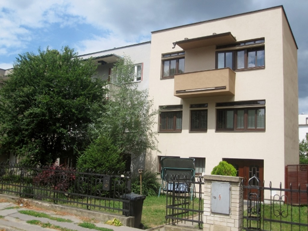
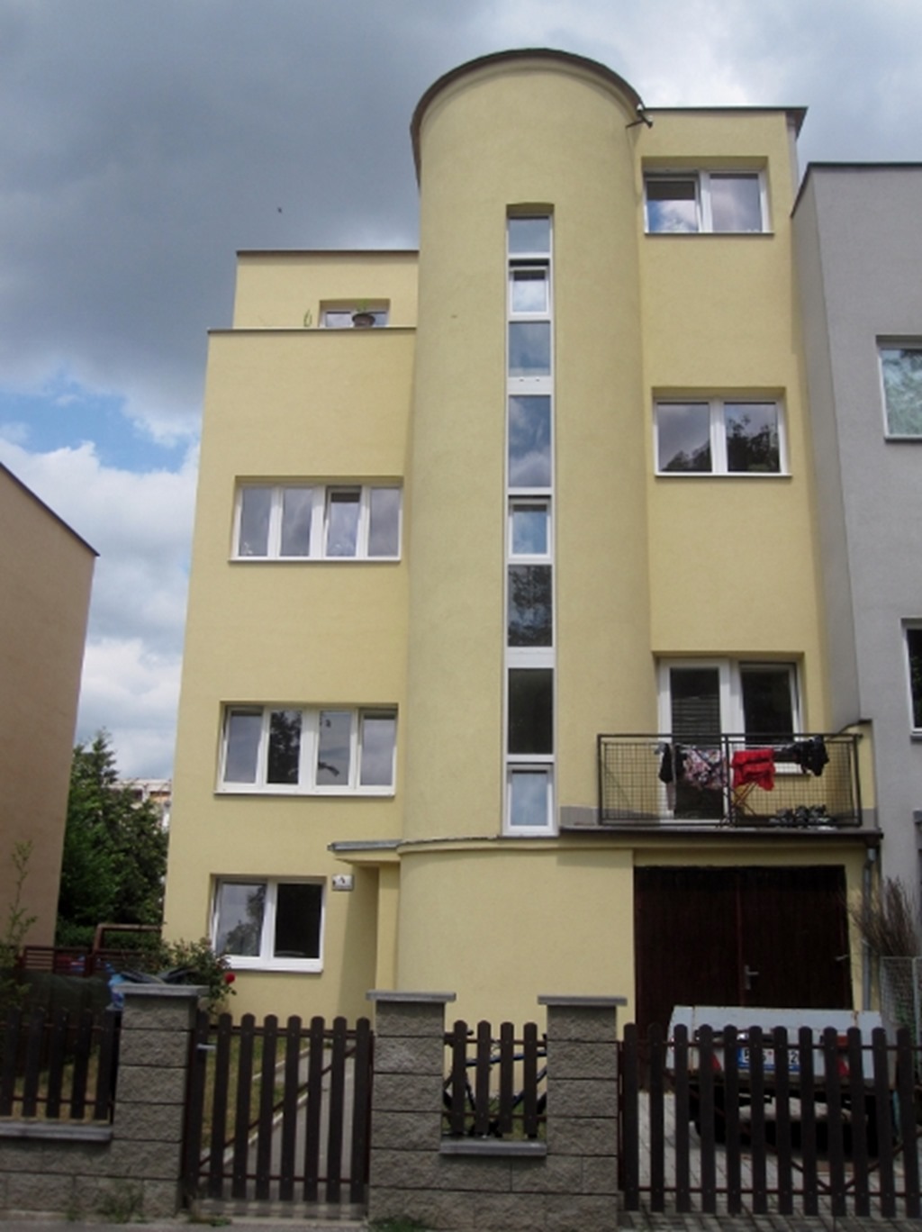
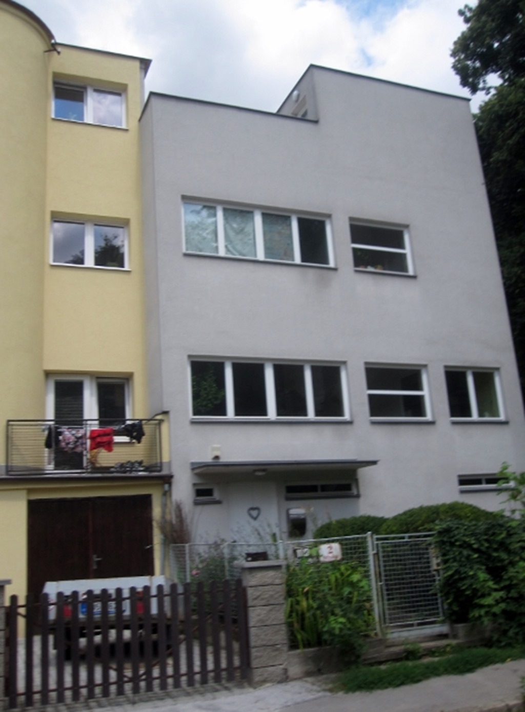
We then go further into the suburbs hoping to find some less opulent modernist examples and find a lovely little cluster.
They still seem pretty big, and most are fairly well looked after, not sure about the fake timber (plastic) doors and windows, but they are practical and more energy efficient than the original metal ones.
These windows are a little more honest, and new. That most be an amazing semi-circular staircase.
But I really liked this one, difficult to see, but was pretty much open plan inside.
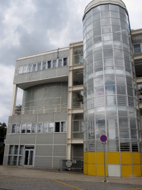
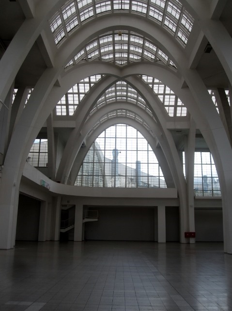
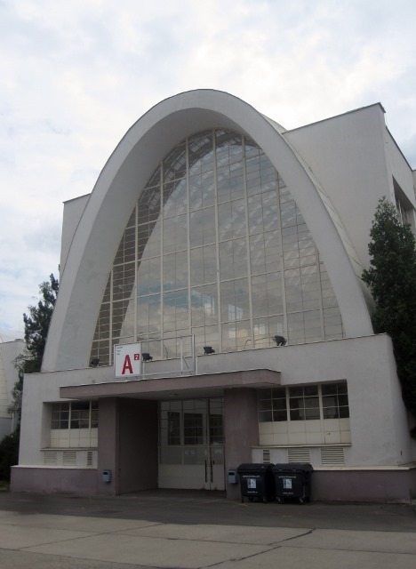
And our final stop in Brno, the exhibition area. The equivalent of Earls Court, or Excel.
Another lovely glass walled staircase and lots of glass block, which now, eighty years on are beginning to fail, or perhaps it is vandalism. Would love to see the interior of this one.
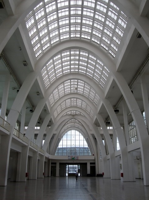
But thankfully we did get an hours pass to see the main exhibitions halls.
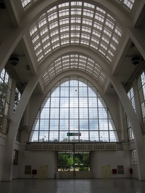
Stunningly simple, and pure engineering.
For the time, what a fabulously light and airy glass wall.
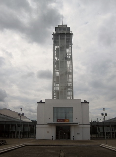
And this folly, I know it has no purpose, but it is a tower, and you know how much we love towers.
What an amazing day.
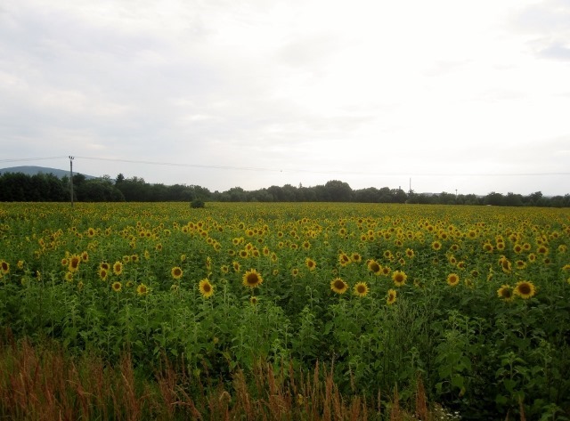
We have had our fill of the city, so head for the countryside, where the sunflowers are following the sun path.
Beautiful. They bring so much happiness and cheerfulness to the countryside. Next house’s garden will have to include some, I will put a proposal forward to the architect. SM.
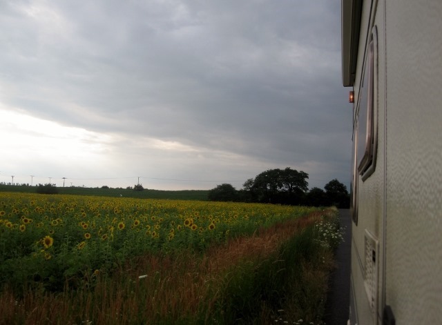
Dora likes sunflowers.![]()
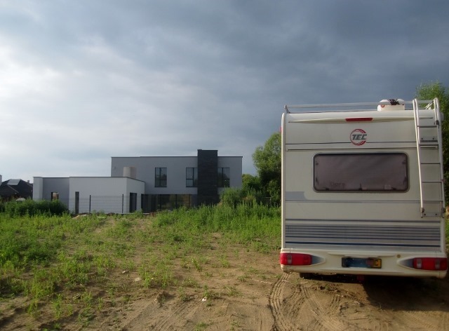
And we just can’t leave modernism behind us, they aren’t afraid of living in the present around here, no desire to live in the past.
That is what has been so good to see, good modern architecture is copied and evolves. It is a shame the same evolution doesn’t take place in the suburbs of the UK!
GDR




Cuanto disfruta Gary con su profesión!!!!!!!!!!
Más que una profesión es un estilo de vida